
Have you ever observed that all those wildly popular you see on Slideshare seem to use the exact graphic they want to convey their point?
Have you ever wondered where do those designers get such precise graphics from?
In this article, I will reveal the real secret of those cool graphics used in most world famous presentations.
Cool Infographics Example 1
Take a look at this beautiful slide from a wildly popular presentation called – ‘Smoke’ shared on Slideshare.net.

Source: Empowered Presentations, SlideShare
The slide is about the alarming rise of the number of smokers in the world.
Somehow the design firm seemed to have caught hold of a beautiful and appropriate graphic of cigarettes that look like a column chart. Right?
No. I am quite sure, they created the graphic all by themselves.
The best part is – you can do that too using nothing more than simple PowerPoint tools.
Let me make my point, by reproducing the same graphic.
Creating The Infographic in PowerPoint
Here is a picture of a cigarette I got from a public domain website:

All I need to do now, is to rotate the graphic vertically and stack the images so they resemble a column chart. See the result here:

As you can see, it is not so difficult after all.
Not convinced?
OK. Let me take another example.
Another Infographic from a popular presentation
This time, the slide is from another world famous presentation called ‘Thirst’ shared on Slideshare.net by Jeff Brenman from Apolloideas.com:

Source: Thirst from Slideshare.net
The graphic conveys the point clearly and in a memorable way.
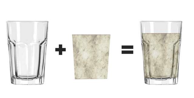
Let us reproduce the graphic by first picking up a picture of an empty water glass. Then, let us draw a shape and add a bit of transparency to make it look like water. When we place the shape on top of the glass, we get a glass filled with water:

If we take the same shape, fill it with a texture of a dirty surface and add a bit of transparency, we get a murky fill like this:

Now, we just need to place the shape with murky fill on the empty glass to complete the graphic as follows:
Can you see how easy it is?
I am sure design firms may be using advanced graphic software like Photoshop to create those graphics. But, you can create pretty decent graphics for yourself using nothing more than PowerPoint.
Interested in sharpening your PowerPoint skills?
Do you want to learn how to create professional looking slides that are clear and memorable?
Then, I highly recommend you take a look at our ‘Ramgopal’s PowerPoint Mastery Program’. It is the most comprehensive and creative PowerPoint training online for business presenters.
In the program, you will learn…
• How to work with pictures like a pro in our ‘PowerPoint Pictures Mastery’ Section
• How to create infographics like the ones you see in international finance magazines
• How to convert your text-based slides into clear and memorable visual slides using a simple 4 step process based on cutting edge neuroscience
…and so much more.
In fact, Ramgopal’s PowerPoint mastery program is the only program you’ll need to take your slides from good to great in the shortest possible time.
Why don’t you click on the link here to know more about the program?
Know More About The Program