
 Are you tired of using default chart types in your presentation?
Do you want to spice up your chart slides for your training sessions?
In this article, I’ll show you how we converted 3 everyday training concepts into interesting data driven charts you can use in your training slides.
Creative Idea 1 : Iceberg Chart
‘Tip of the iceberg’ is a well-known phrase used in training.

It is a metaphor to indicate that ‘What is visible is just a small portion compared to what lies hidden’.
You can convey this in a conceptual way like the slide above or you can assign some numbers to make the point even clearer like this:

You can convert this interesting concept into a Data Driven chart like this:
 The way this chart works is –
- You can show the performance for different months as usual
- You assign a benchmark value (or quota value) that needs to be crossed. Anything below this value is under water. The values above benchmark are the tip of the iceberg as you see above
- The chart automatically shows the values above benchmark with data labels and the others are hidden inside water as you see above
The best part is – this chart is super easy to edit with your own data. For example, let’s change the value of April from 21 (which is below benchmark) to 30 (above benchmark). See what happens:

As you can see the value for April comes above water and the data label shows the exact value automatically.
This chart is an interesting way to add meaning to the data points in a performance.
Creative Idea 2 : Speedometer chart
Speedometer is a well-known metaphor used in training to assign qualitative parameters to performance.
A typical speedometer graphic looks like this:
 You use this graphic to talk about qualitative performance of a team or person.
We decided to convert this simple graphic into a data driven chart, which looks like this:

On the face of it, you may not realize that this is a data driven chart. But, the moment you right click on the needle → Edit data, you see a worksheet pop up. You then change the performance value and see what happens:

We changed the project completion percentage from 35% to 75%. The needle automatically moved from Medium to High.
You just need to change the value of a single cell and the chart updates automatically.
Of course, you can assign your own values to determine the qualitative parameters like Low, Medium and High. Isn’t that interesting?
Creative Idea 3 : Thermometer chart
Another common phrase used in training is ‘Temperature of an opportunity’. You tend to assign tags like ‘Hot, Warm or Cold’ to a prospect.
A typical thermometer graphic looks this on a presentation slide:

We converted this into a data driven chart where the mercury levels vary as per the percentage indicated. Take a look at the chart here:

The sleekness of the graphic may not allow you to guess that the thermometers are indeed data driven. But, see what happens when you edit the data in the embedded worksheet:

By changing the value of a single cell, you make the thermometers show the value automatically.
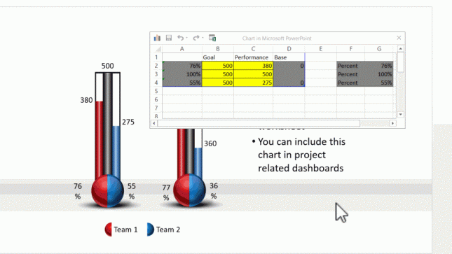
If this is interesting, we’ve taken the idea to the next level with dual thermometer charts. The chart shows two performance values compared to a common target:

For example, the chart on the left has a common goal of 500. The red and blue levels show the performance of two different teams compared to the target. Notice the percentage achievement indicated by the numbers right next to the spherical bulb at the bottom of the thermometers.
Now, let us change the performance values of the teams and see how the chart reflects the changes:
 Isn’t that beautiful?
So, with a bit of imagination, you can convert common concepts into meaningful data driven charts and use them in your training presentations.
If you are challenged for time, or if you are not too comfortable working with advanced chart functions of PowerPoint, I recommend you take a look at our readymade PowerPoint templates solution for trainers.
Use stunningly creative Data charts in your training slides easily:
The quickest way to create engaging and memorable Data charts for your training presentations is to use premium PowerPoint templates specifically designed for trainers.
All the examples I showed above are taken from our Comprehensive All In One PowerPoint Templates Bundle 2.0. The bundle offers a massive collection of 4200+ templates specifically designed for any professional presentation. The bundle has unique collections like – Industry specific models & frameworks, interactive game templates, interactive tab templates, industry specific icons and a massive collection of trainer assets that help you create your training presentations in a heartbeat.
Why don’t you find more details about the bundle by visiting this page?
You will discover a whole new way to create training presentations that grab and hold your audience’s attention – FAST.